Graduate Degree Show

UNADJUSTEDNONRAW_thumb_1461

After seeing last years graduation degree show I had high expectations and once again it was amazing to see what the third years had created and achieved. With several of them gaining ISTD awards it is a really good motivation for me to want to do the same and if not then at least have tried to create some high-quality work.

UNADJUSTEDNONRAW_thumb_1462

Below are some of my favourite projects from this year’s degree show and my favourite being the editorials. I love editorial work and that is one thing I want to look into more over my placement year as a personal project.

This slideshow requires JavaScript.

Also, I picked up several business cards as I did this last year too. I was able to look on their Instagram’s and websites to see what type of presence the had online to have a sense of what is expected this year for me but also in the future as I progress.

unadjustednonraw_thumb_1464.jpg

Website Building

After the workshop we had with Ian where we discussed a range of different website builders, I decided to go ahead with WordPress. This was what I had used in the tutorial with Matt and it was a great platform to use. However, as I began to build my website after paying for the personal plan, I realised how limited I was with templates and which I could choose from. I was unable to change colours or font and was restricted to the theme’s choices.

Screenshot 2019-06-05 at 16.37.35

Therefore, I needed something which I could customise more and preferably for the same price. Then I had a look at some of the third years websites and noticed how many were built using Adobe Portfolio. This seemed to be a great solution especially with me already paying the adobe creative suite.

I had to transfer my URL from WordPress to a new DNS server which adobe portfolio are partnered with and was able to sort out a new website portfolio. I am very happy with my outcome and think that its suites my design style well, clean, simple and minimal. The colour pallet of red, white and black continues to play across the website and I was able to change the typeface on adobe portfolio to Europa Bold and Regular. This makes me look a lot more professional and I am really happy I was able to connect my CV, Portfolio and Website all together collectively in the same look and feel throughout.

Screenshot 2019-06-05 at 16.50.03

www.wertdesign.co.uk

Have a look at my website, hope you enjoy.

Speculative Email

The speculative email was something which I knew was not going to be a large document however, it would take me a while to create as I am not the best at talking about myself to others. I have never been one to big myself up and so selling myself is something I find more difficult than others but improving slowly as I know I must in order to survive in the design world. Below is the copy of the speculative email I wrote:

Hi Ian,

My name is Dylan Wert, I am studying Graphic Communication at Cardiff School of Art and Design, finishing my second year of study.

I have been following Portobello Design on Instagram and Twitter for the last couple months and have been loving the work you continue to create. From the new brand logo and identity of Bristol City FC to some of the charity design work that you have also done. I really like the flat badge design which incorporates some of Bristol’s landmarks and history. Inclusive of the culture and history of Bristol but attractive to the football market.

Coming out of my second year of my degree, I want to push my design skills further. Having already gained a great deal from my couple of years in design I am eager to continue to learn more. My main reason today for emailing your studio is to ask whether your studio is offering an opportunity for work placement for design students like me?

Attached to this email is a copy of my CV and Portfolio, showing some of the work I have recently been working on. If you have the time it would be amazing to meet you and I would really appreciate you spending the time to look through possibly offering any feedback on my work. Also, my website and social media is listed below.

Hope to hear from you soon,

Kind regards

Dylan Wert


CV and Portfolio – Feedback and Finals

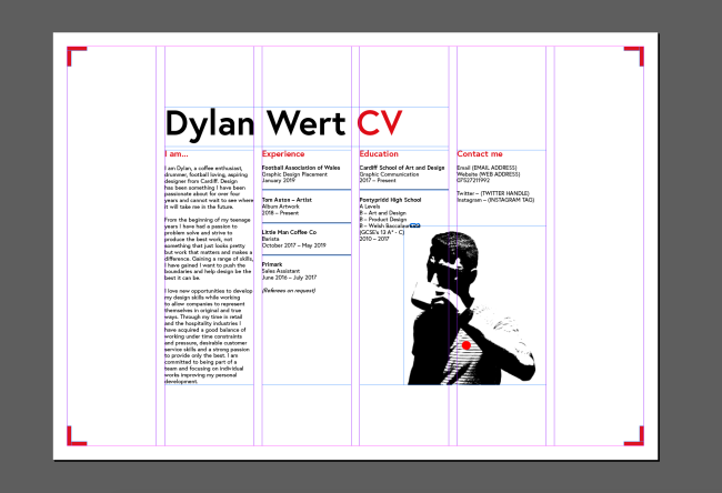
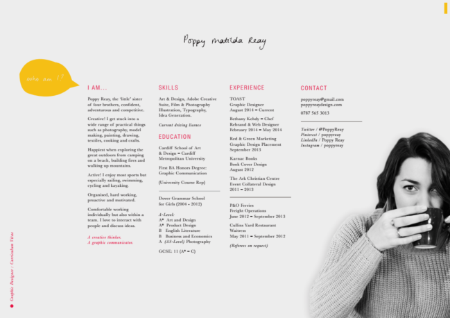
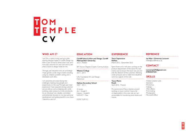
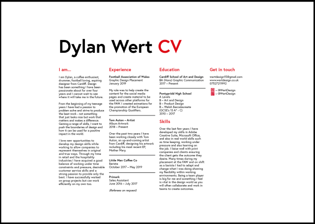
My feedback from my CV was that there needed to be more breathing room between the title and bodies of text. The gap could be filled with a skills section as this was something that I had not yet included. Also, that the whole body of text could be shifted down the page slightly for more white space above.

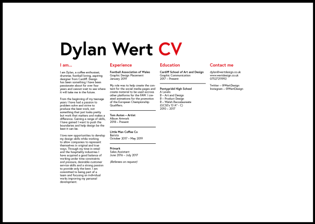
I made all of the above changes but also some of my own I felt would aid the overall design. These were expanding on my experience with Tom Auton and also including social media icons for twitter and Instagram that were interactive. This means as an interactive PDF it would be quicker and easier to load up these social media pages and look at my presence there. Below is my final outcome:

Screenshot 2019-06-04 at 19.56.33

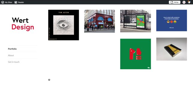
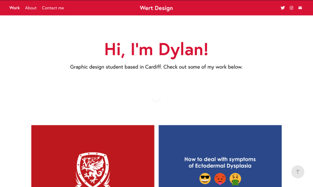
My feedback from my Portfolio was more in depth with some big changes needed for improvement. One main difference was that the navigation was now all in one location at the bottom left of the pages. This meant it wouldn’t take as much work for users to scroll across the page to simply click the next page button.

Screenshot 2019-06-04 at 19.48.01

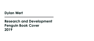
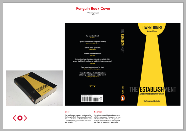
The Penguin Book cover page had to include the flat image of the cover for marking purposes, but I maybe would not include that in a portfolio in the future.

Screenshot 2019-06-04 at 19.48.25

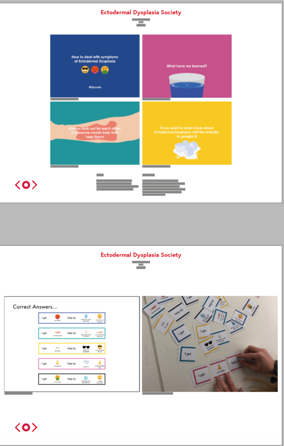
Another big change was to have the ED work split into two sections. The first page being four of the slides from the presentation and the second being the game. This allows the viewer to understand each concept individually rather than them all being on the same page.

Screenshot 2019-06-04 at 19.49.22

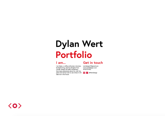
Finally, the last page includes ‘Dylan Wert Portfolio’ like the first page to round it back up to what it is all about with contact information and social media links below.

Screenshot 2019-06-04 at 19.51.47

Overall, I am happy with the outcomes that I have produced and think they are so much better than my portfolio from last year and CV’s I have used to get jobs. Do I think that there is room for improvement, however? Yes of course! The portfolio and CV should always be looked at and review to update it as I create new work building an even stronger collection for my career chances in the future.

Dylan Wert Portfolio Final

Portfolio Development

Last year’s portfolio was laid out in a portrait format with block colour title screens separating each projects work. Looking back at it now I would have changed a lot of it and for this year’s portfolio this will be a huge change. The first is that it will be in landscape mode. This allows for better access to inserting imagery and outcomes and also looks better alongside landscape CV’s which I am creating too.

Last Year’s Portfolio

First draft of my portfolio is shown below. I was really happy with the initial layout of the portfolio as I was able to give enough space to each of the projects however felt like I was giving too many pages to some of the projects like On Display.

After feedback I was given was really encouraging and a lot of changes but worthwhile in improving my piece. To take away the photography marks like the CV and also to include interactive buttons as the portfolio needs to be interactive. The second page also now has imagery from each project to link it to the ‘Home’ page. This allows for the interactive portfolio used more if they wish to use the buttons. I was also more selective of the information that I included. This was because initially I had too much for projects like On Display but now, I was showing the working I wanted to rather than all of the outcomes.

Next, is to take this to my tutorial with my lecturers and peers to gain feedback on where and what can be improved. My approach is a minimal design and so I am trying to show how I am a minimalist designer through the way my work is laid out. However, that does come with the challenges of overthinking it all and adding too much or taking too much away.

CV Development

This is my first CV design which I felt was a good representation of me. The corner marks represent that I like photography and also that I like everything to be central and clean. A lot of my design style is clean and simple design and I think that this was represented in the first draft. I also following on from some examples felt it would be good to include a photograph of myself because it would make it more human.

Screenshot 2019-06-03 at 18.22.00

At this point I did not have my contact information sorted but I did ensure to include an area for it to be situated in so that I could easily change this later on. With hindsight of the first draft I felt it lacked colour and decided to add the colour red after a lot of samples because I felt it worked best with white and black.

Screenshot 2019-06-03 at 18.26.02

Adding the use of the colour really helps the CV stand out more however after talking to my lecturers and a few fellow students I decided that the photograph did not represent me as well as I would have liked. My face is hidden and not smiling, that was not me in a photograph. Also, the photographer marks made the CV look like a photographer’s CV rather than a graphic designer. This was a bad idea and once I removed them it actually allowed the design to breathe more and occupy the page a lot better.

Screenshot 2019-06-03 at 19.45.07

For the final design I do want to see if I can change the design so it does not have a line riding along the bottom of the text as I feel the column lengths need work.

Portfolio – Research CV design

I felt it was essential to start this by researching good CV design and looking at clear examples of what to do and what not to do. Based off of examples we had been given I had seen one or two which I really liked. Building mine using good features of theirs and ensuring to create a CV which shows off my design style and personality is essential to this.

Screenshot 2019-05-22 at 09.50.34

Screenshot 2019-06-03 at 18.14.42

Shown above are two examples which look very different one purely type and the other with the use of a photo of them. I like both and will see if I can create a CV that uses both of those features in my own.

I then went on to look at more CV’s that I could find online that I felt would be good to reference as I created my own. Also, taking the information I gained from the prior workshop I was confident I would create a CV that best represented me as a designer.

Task 3+4 – Research and Development

Screenshot 2019-06-03 at 17.59.54

This document includes the Research and Development of Task 3 and 4 of persuasion. Both show the development of the outcomes and how I got there through research and exploration. After seeing the whole stories, I feel confident about task 4 but do wish I had done a better job on task 3. The idea is there but the execution is just not as good as I would like it to be. If I had put more time into It, I think the outcome could have been very different and therefore perform better.

However, overall, I am happy and looking forward to making next challenge.

Research and Development Task 3 + 4

Above is my PDF document for the projects.

Penguin – Research and Development

Screenshot 2019-06-03 at 17.52.12

Putting together the research and development document for the Penguin book competition made me realise just how the whole process went and what I would maybe do differently next time. Being able to see the research process right up to the final cover in one place was a great way to see how the design process worked and where my idea came from.

I think from this that I did successfully complete the brief and what the expectations were. I was really happy about the final book cover and the use of my colour and type choices work with the book. With the overall feedback and thoughts on the project I felt reading the book was essential to the project and without doing that I would not have come to the outcome that I did.

Research and Development Penguin PDF

Above is the PDF document which shows the journey I took to create the cover.